How I rebuilt my website off Wix onto a free stack
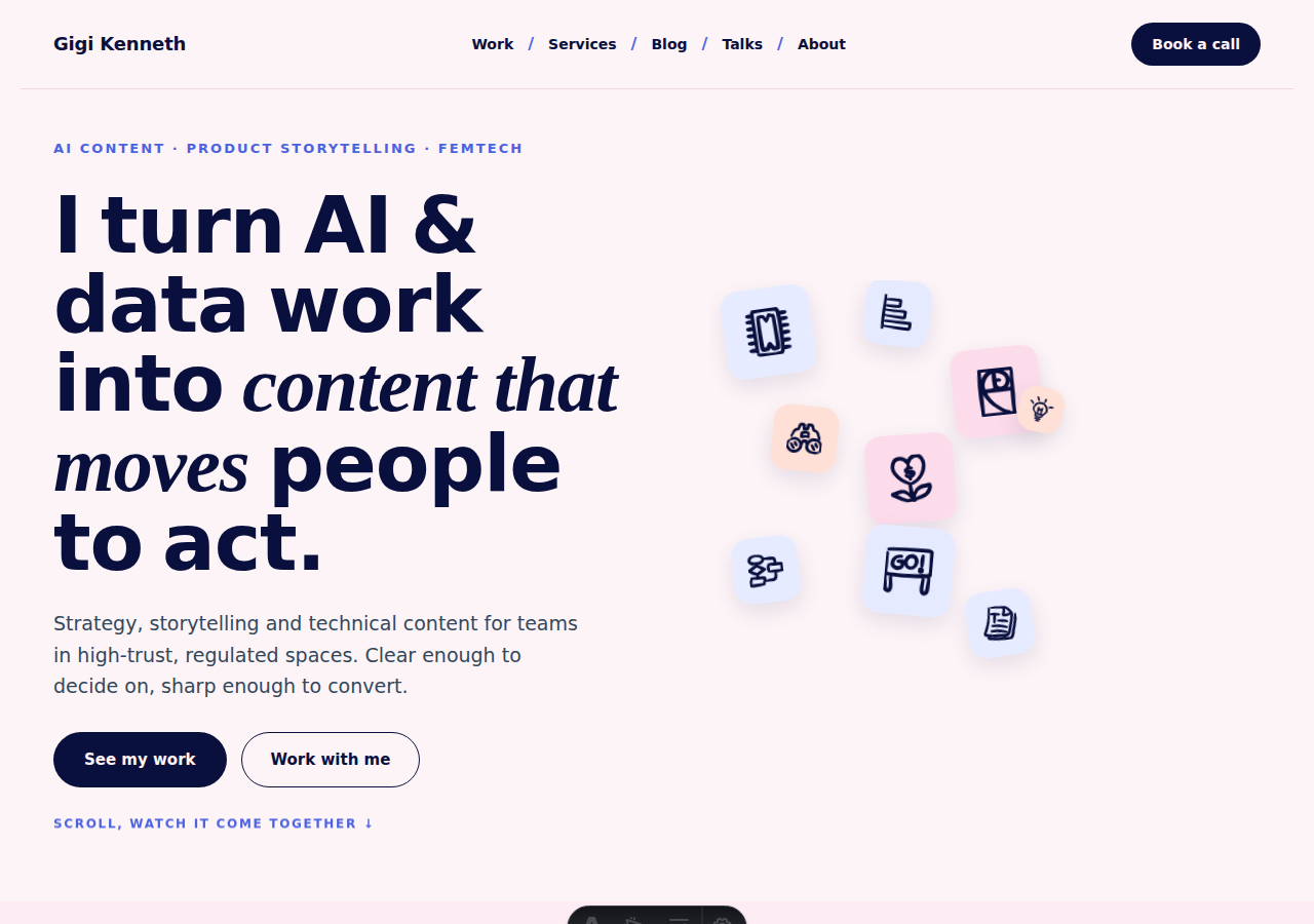
I moved my website off Wix. Not because Wix is bad (it is a perfectly capable platform) but because I wanted three things it could not give me at once: full control of the code, a site that stays fast and cheap as it grows, and a way to write and publish without paying a subscription forever. I ended up on a stack that is free to run, and the whole cutover happened with zero downtime and, more importantly, without my email going dark for even a second.
This is the complete account of how it went: the stack, moving years of content, building a brand and design system, the read-aloud player, the Now page, the Favourites section, the accessibility audit, the SEO and GEO setup, and the domain cutover that everyone is nervous about.
The migration at a glance
The stack I moved to
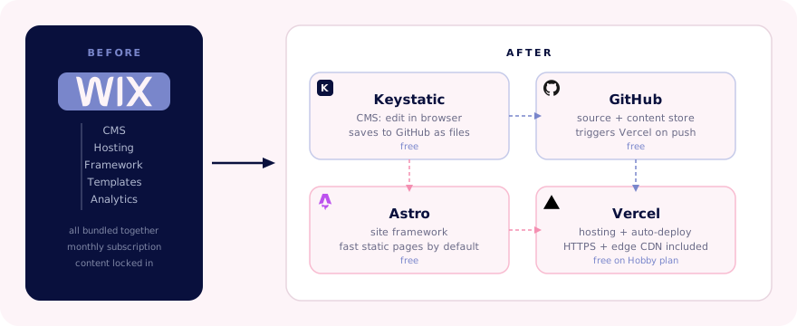
The goal was a site with a proper content workflow, not a pile of files I have to edit by hand. Here is what it looks like now:
- Astro (the site framework) is free. Fast static pages by default, which is exactly what you want for a personal or business site.
- Keystatic (the CMS) is free. This is the part that makes it feel like Wix: I edit the blog, galleries, and pages through a simple admin interface in the browser. Under the hood it saves straight to my GitHub repository, so the content is version-controlled and mine.
- Vercel (hosting) is free on the Hobby plan, plenty for a personal or small business site. Every time I save in the CMS or push code, it redeploys automatically.
- GitHub (where everything lives) is free.
- Your domain you already pay for, and it does not change.
Add-ons I kept, all free: Substack for the newsletter, Cal.com for bookings, and Google Analytics behind a cookie-consent banner. The whole stack costs nothing to run.
Moving years of content across
This was the part I dreaded, and it turned out fine. I had more than fifty blog posts, a full multi-lesson course, galleries, case studies, and favourites lists sitting inside Wix. The trick was to treat content as data, not as pages.
Everything now lives as plain files in the repository: blog posts as Markdoc files, courses and projects as structured data, images in a public folder. Because the CMS writes to those same files, I get the best of both worlds. I can edit in a friendly interface, but nothing is locked inside a proprietary system. If I ever want to leave this stack, the content comes with me.

The one rule I held to during the move: keep every URL. Search engines had already indexed my old post links, so I made sure each one still resolves on the new site, and set up redirects for anything that moved. That is the difference between a migration that keeps its rankings and one that quietly throws them away.
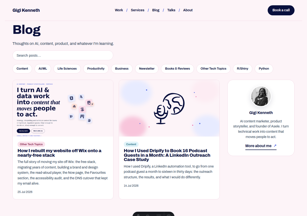
You can browse the full blog here, now with ten posts per page, category filters, and a search box.
Figuring out the brand and design
Wix templates are convenient, and they also make every site look a bit like every other site. Rebuilding from scratch meant I had to decide what mine should feel like.
I wrote myself a small brand system before touching a single page: a palette (periwinkle blue and pink on a soft pink-white canvas, deep navy text), a type pairing (a strong sans for structure, an expressive serif for accent words), spacing, motion, and a set of hand-drawn doodle icons so the personality did not depend on stock imagery. Having that written down first is what kept the site feeling like one thing instead of ten different moods stitched together.
The direction I landed on is editorial and a little playful: flat colour, bold headlines, gentle motion on scroll, and small interactive moments rather than a wall of animation. Deciding the rules up front made every later page faster to build, because the answers already existed.
The read-aloud player
One of my favourite additions to the blog is the read-aloud player, a docked audio bar that reads any post out loud, directly in your browser.
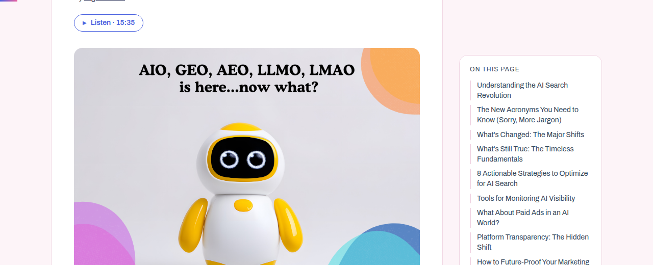
It is built on the Web Speech API, which ships in every modern browser. No paid text-to-speech service, no API key, no ongoing cost. A "Listen · M:SS" button appears at the top of each post and opens a fixed player bar at the bottom of the screen with:
- Play and pause
- A seekable progress track (click any point to jump there)
- Elapsed and total time estimates
- Speed toggle cycling through 1×, 1.25×, 1.5×, and 0.75×
Voice selection prefers Google US English or Microsoft Aria, then falls back to whatever English voice the browser has installed. The text is split into sentences so the reading stays smooth across long posts, and the player respects the prefers-reduced-motion setting. The whole thing works offline and costs nothing.
The Now page
A now page is a short page on your site that answers one question: what are you focused on right now? The idea was popularised by Derek Sivers, and there is a public directory of people who keep one at nownownow.com. The page is meant to be brief and current: a clear signal of where your attention is, without the permanence of an About page.
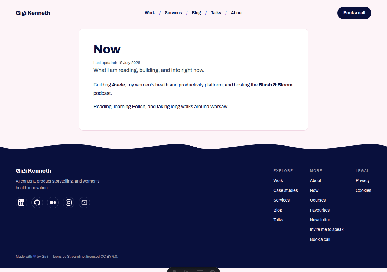
Mine is deliberately short: what I am building, what I am reading, where I am. It gets updated whenever something significant shifts, and the last-updated date is shown at the top so it is always clear how fresh it is. It is the kind of page I wish more people had: a quick way to know what someone is into right now, without having to read a full biography.
The Favourites page
The Favourites section is one of my favourite parts of the site, and one of the things I am most glad I built properly rather than leaving as a static list.
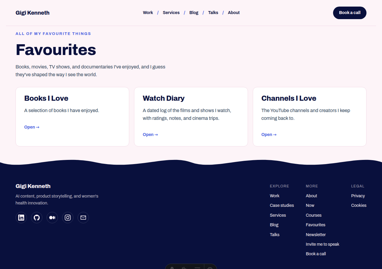
It has three sections:
Books I Love: an annotated reading list with books organised by the impact they had: books that changed me, non-fiction I recommend, fiction I loved. There is a collapsible archive going back to 2018, covering everything from dystopian fiction to AI and science.
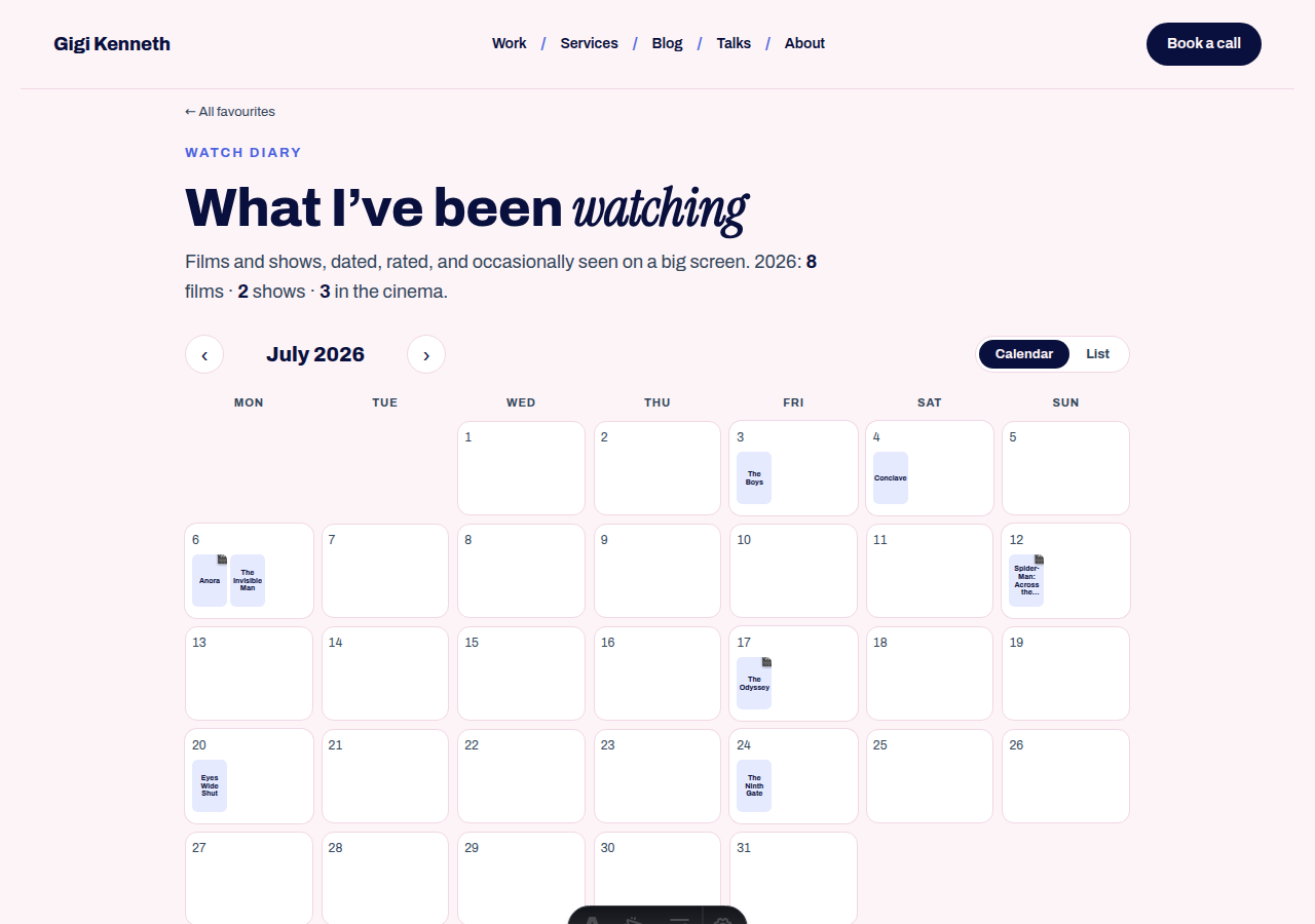
Watch Diary: a calendar view of every film and show I watch, with poster images pulled automatically from TMDB, half-star ratings, cinema trip flags, and notes. You can jump to any month or switch to a list view grouped by month.
Channels I Love: a curated showcase of the YouTube channels and creators I keep coming back to, grouped by category.
None of this worked inside Wix templates. Having the code meant I could build each page the way it needed to work.
A private live dashboard
Because I owned the code, I could also build things that are harder to explain but satisfying to use. One is a private dashboard at /live (password-protected, owner only) that shows which pages visitors are on right now, updated in real time, using a cookieless beacon that reads Vercel's edge geolocation. No IP addresses stored, no third-party tracking, just a live feed pushed to my phone via ntfy.
It is not essential. It is exactly the kind of thing that makes building your own site more interesting than renting one.
The accessibility pass
A site nobody can use is not a finished site. Before launch I ran a full accessibility audit across every page against WCAG 2.1 criteria. The site passes on the things that matter most:
- Colour contrast meets the AA threshold across all text and interactive elements
- Heading structure is semantic throughout, so screen readers and document outlines make sense
- Keyboard navigation works on every interactive element, with visible focus indicators
- All images carry descriptive alt text
- Motion respects the
prefers-reduced-motionsystem setting, including the read-aloud player and scroll animations - ARIA labels are in place on navigation, buttons, and landmark regions
Accessibility is not a one-time check; it is an ongoing list. The audit lives in docs/accessibility-audit.md and gets revisited with each new feature.
SEO and GEO
Two acronyms, one goal: make sure the site can be found, by traditional search engines and by the AI answer engines that are increasingly the first stop for research questions.
Traditional SEO
The foundations live in a few dedicated files:
public/sitemap-index.xml: auto-generated at build time by@astrojs/sitemap, and submitted to Google Search Console. Draft posts and pages with a canonical pointing elsewhere are automatically excluded.src/components/Seo.astro: the<head>template that emits the title, meta description, canonical tag, and full Open Graph and Twitter card markup so shared links render correctly.src/lib/seo.ts: reusable Schema.org JSON-LD objects:PersonandWebSitefor the site identity,BlogPostingplusBreadcrumbListon each post, andFAQPageon the services page. These make posts eligible for article rich results and breadcrumb trails in search.public/robots.txt: standard crawl directives, plus explicit GEO allowlist (see below).- Preserved URLs and 301 redirects from the old Wix structure, so no indexing history was lost in the move.
GEO: optimising for AI answers
GEO (Generative Engine Optimisation) is the practice of making content legible and citable by AI tools like ChatGPT, Claude, and Perplexity. The approach here is three-pronged:
1. Explicit crawler permission: public/robots.txt has individual Allow: / entries for every major AI crawler: GPTBot, ChatGPT-User, ClaudeBot, PerplexityBot, Google-Extended, Applebot-Extended, cohere-ai, Meta-ExternalAgent, and others. Many AI tools respect robots.txt by default, so being explicit means the content can be indexed and cited.
2. Answer-first meta descriptions: every post's meta description leads with the conclusion, not an introduction. Instead of "In this post I cover…", the description opens with the takeaway. AI answer engines often quote the meta description when summarising a page, so the most quotable sentence goes first.
3. Structured data: the JSON-LD on posts and pages gives AI tools a machine-readable summary of who wrote something, when, and what it is about, so citations can be attributed correctly.
The domain and email cutover
Here is the single most important thing I learned, and the reason most people stay stuck on Wix: moving your website and keeping your email are two entirely separate things, and you can do the first without touching the second.
Your domain has DNS records. Some point to your website. Others point to your email. When you migrate hosting, you only change the website records. Leave the email records alone and your email never even notices.
The cutover was:
- Add your domain to the new host. It tells you the two records to set.
- Change only the two website records at your DNS provider: the
Arecord for your root domain, and theCNAMEforwww. - Do not touch anything else. Leave every email record alone:
MX,SPFand verificationTXTrecords,DKIM,DMARC. Those are your mail.
Within a few minutes to a few hours the new site was live with automatic HTTPS, and I sent a test email to myself to confirm nothing had moved. It had not.
A few gotchas worth knowing:
- Back up first. Screenshot your DNS records before touching anything, and export your mailbox and documents as insurance.
- Reseller subscriptions are sneaky. If you bought email through Wix, it is billed by Wix as a reseller. Check whether it is a separate subscription (mine was, even prepaid for a couple of years) before cancelling anything.
- Do not switch nameservers unless you have to. If you hand all your DNS to the new host, you have to recreate every email record there, which is the one risky step you are trying to avoid.
What it costs
The website is free to run. The CMS, hosting, analytics, newsletter, and bookings are all free. Your domain you were already paying for, and that does not change.
Was it worth it?
For me, yes. I own my content, the site is faster, I can build whatever I want, and I am not paying a monthly fee to keep the lights on. The migration was far less intimidating than I expected once I understood that my website and my email were never joined at the hip.