A Beginner's Guide to Writing Landing Pages, Ad Creative, and Funnels That Convert 15x Faster (2025 Guide)
- Gigi Kenneth
- Oct 3, 2025
- 8 min read


If your landing pages aren't converting, you're basically throwing money into a digital bonfire and hoping something sticks. (Spoiler alert: it usually doesn't.)
But here's the good news, you're definitely not alone. Most marketers are leaving serious cash on the table simply because they don't understand the psychology behind what makes someone click "buy now" versus "nope, I'm outta here."
The average landing page conversion rate across all industries sits at just 6.6%.
That means for every 100 people who visit your page, only 6 or 7 actually take action.
But the top performers? They're crushing it with conversion rates of 10% or higher and some are doing even better.
The difference is strategy.
In this guide, I'm breaking down exactly how to write landing pages, ad creative, and sales funnels that don't just look pretty, they actually convert.
Whether you're selling products, generating leads, or building an audience, these principles will completely transform how you approach conversion copywriting.
Why Your Current Approach Isn't Working (And Why That's Okay)
Before we go into what works, let's talk about what doesn't. Think of this as the "please learn from my expensive mistakes" section.
Most landing pages fail because they:
Focus on features instead of benefits (nobody cares about your "revolutionary algorithm", they care if it saves them time)
Lack a clear value proposition in the first 3 seconds (attention spans are shorter than a goldfish's these days)
Have too many distractions or competing calls-to-action (it's like going to a restaurant with a 47-page menu)
Don't match the message from the ad that brought visitors there (classic bait-and-switch vibes)
Ignore mobile optimization (where over 60% of ad views now happen)
Here's something that might surprise you: shorter landing pages with clear CTAs outperform longer ones.
But that doesn't mean you should always go short; it means you need to be intentional about every single element on the page.
The Psychology of High-Converting Landing Pages
The First 3 Seconds Matter Most (No Pressure)
You need to introduce your content proposition in the first 3 seconds for better recall and awareness.
That's not a lot of time, it's barely enough to microwave a burrito.
Your headline needs to immediately answer: "What's in it for me?"
Think of your headline as a promise. Not a clever tagline. Not a corporate mission statement that sounds like it was written by a committee of robots. A clear, benefit-driven promise that speaks directly to your visitor's pain point or desire.
Copywriting Frameworks That Actually Work
The best landing pages follow proven psychological frameworks. Here are the three most powerful (and no, I didn't just make these up):
1. PAS (Problem-Agitate-Solution)
The PAS framework focuses on identifying and addressing a problem, then intensifying it before offering relief. This works because humans are more motivated to avoid pain than to seek pleasure. (We're fun like that.)
Structure:
Problem: Clearly state the problem your audience faces
Agitate: Make them feel the consequences of not solving it (without being mean about it)
Solution: Present your offer as the answer
2. AIDA (Attention-Interest-Desire-Action)
AIDA is a four-step process that captures attention, builds interest, creates desire, and encourages action. This classic framework has stood the test of time for a reason, it mirrors the natural buying journey.
Structure:
Attention: Hook them with a bold headline or visual
Interest: Build engagement by highlighting benefits
Desire: Show them the transformation they'll experience
Action: Tell them exactly what to do next
3. Before-After-Bridge (BAB)
BAB is designed to show the transformation that your product or service can bring about, highlighting the benefits or positive change.
Structure:
Before: Paint a picture of their current struggle
After: Show them life after using your solution
Bridge: Explain how your product gets them there
The Anatomy of a High-Converting Landing Page
Based on current data and best practices (aka stuff that actually works in the real world), here's what every high-converting landing page needs:
1. A Compelling Headline
Your headline should pass the "blink test", someone should understand your core value proposition in under 3 seconds. Using a well-written headline could lead to a 3 times higher conversion rate.
No pressure or anything.
2. A Clear Subheadline
Expand on your headline with 1-2 lines that provide more context. This is where you can add specificity about who you help and how. Think of it as your headline's supportive best friend.
3. Social Proof
Testimonials are featured in 36% of the top-performing landing pages. But don't just slap up generic reviews like "Great product! 5 stars!" Use specific testimonials that address objections and highlight transformations.
4. Minimal Form Fields
Here's a stat that'll make you rethink your 17-field contact form: landing pages with sign-up forms asking for just an email and phone number had a conversion rate of 10.15%, while those asking for personal information like birth date or gender had lower conversion rates of 5-6%.
The rule: only ask for what you absolutely need. Every additional field is basically you asking your visitor to do more homework.
5. A Single, Clear CTA
Calls-to-action convert 202% better when they're personalized. But beyond personalization, your CTA needs to be:
Action-oriented ("Get My Free Guide" beats "Submit" every time)
Visible without scrolling (because scrolling is apparently too much effort)
Free of friction (no "maybe later" options lurking nearby)
6. Mobile-First Design
Globally, 64% of web traffic comes from mobile devices. If your landing page isn't optimized for mobile, you're automatically losing more than half your potential conversions. That's not a typo, more than half.
Writing Ad Creative That Drives Clicks
Your landing page is only as good as the traffic you send to it. That's where ad creative comes in, think of it as your landing page's hype person.
The 4:5 Vertical Format Dominance
The 4:5 vertical crop outperforms 1:1 square in Feed placements by up to 15%, more screen space equals more attention. This isn't just about aesthetics; it's about real estate on the screen. (And unlike actual real estate, this doesn't require a mortgage.)
Hook Them in 6 Seconds
Prioritize your hook in the first 6 seconds (maybe even 3 seconds at this point) to boost engagement and increase watch time by creating suspense, surprise, or other emotions.
The best ad creative:
Starts with a pattern interrupt (something unexpected—like a purple cow)
Creates an information gap that makes people want to learn more
Shows rather than tells whenever possible (show, don't tell, remember high school English?)
Includes captions (most people watch with sound off, probably while pretending to work)
Platform-Specific Best Practices
For Meta (Facebook/Instagram): A more structured and serious approach using drama-led scripts and interview formats performs better than playful content. Bold captions and graphic CTAs boost retention for silent viewers.
For TikTok: Use an authentic, not overly polished style, include sound, orient vertically, and film at least at 720-pixel resolution. Feature people and plug into current trending topics for relevance. (Yes, even if you're a B2B brand. Especially if you're a B2B brand.)
The Power of Testing (AKA Failing Forward)
77% of businesses worldwide use A/B testing on their websites, but only 1 in 8 A/B tests produces a statistically significant result.
This means most of your tests won't lead to breakthrough discoveries, but the ones that do can transform your entire business.
Test everything: headlines, images, CTAs, colors, and especially your value proposition. Think of it as scientific gambling, but with better odds.
Keep updating, testing, and asking questions.
Building Sales Funnels That Actually Work
A landing page is just one piece of the puzzle. To truly convert 15x faster, you need a complete funnel strategy. (Sorry to break it to you, but one page isn't going to cut it.)
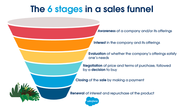
Understanding the Modern Sales Funnel
The traditional sales funnel consists of stages that represent the customer journey from awareness to purchase, with each stage requiring specific content and messaging.
The five core stages:
Awareness: They discover you exist (congrats, you're on their radar!)
Interest: They engage with your content (they're curious)
Consideration: They evaluate you against alternatives (the comparison shopping phase)
Decision: They're ready to buy (so close!)
Action/Loyalty: They purchase and become repeat customers (jackpot!)
Why Traditional Funnels Are Evolving
Digital transformation has fractured consumer journeys into unpredictable, nonlinear patterns, requiring marketers to move beyond the linear funnel to more flexible "influence maps".
This means your funnel needs to:
Allow for non-linear paths (people don't always move sequentially, they're chaotic like that)
Provide multiple entry points
Include retargeting strategies for those who drop off
Focus on the overall customer experience, not just the sale

Content Strategy for Each Stage
Top of Funnel (Awareness):
Educational blog posts
Social media content
Lead magnets (free guides, checklists, templates)
Webinars
Middle of Funnel (Consideration):
Case studies
Comparison guides
Product demos
Email nurture sequences
Bottom of Funnel (Decision):
Limited-time offers
Sales pages
Product walkthroughs
One-on-one consultations
Advanced Strategies for 15x Faster Conversions
1. Speed Matters (Like, Really Matters)
Landing pages that load in 0-2 seconds perform much better than those that take longer to load for every extra second a page takes to load, conversion rates drop by about 4.42% during the first five seconds.
Optimize your images, minimize scripts, and use a reliable hosting provider. Your visitors aren't going to wait around; they have cat videos to watch.
2. Dynamic Content Wins
Dynamic landing pages, which automatically change based on things like the user's location, browsing history, or device, convert more mobile users.
Even simple personalization like showing the visitor's city name or referring to the specific ad they clicked can significantly boost conversions. It's like marketing magic, but with code.
3. Remove Navigation
Stripping a landing page of its navigation doubles its conversion rate. Every link is a potential exit. On a dedicated landing page, keep visitors focused on one goal: your CTA.
Think of it like a choose-your-own-adventure book, but with only one good ending.
4. Use Video Strategically
Videos on landing pages help users retain 95% of the message, increasing the chances of conversion by making your offer more memorable.
But don't just add video for the sake of it. Make sure it:
Loads quickly (see point #1 about speed)
Has captions (accessibility matters!)
Is under 2 minutes (attention spans, remember?)
Includes a clear CTA at the end
5. Leverage Scarcity and Urgency
Limited-time offers, countdown timers, and stock indicators tap into loss aversion, people's tendency to avoid missing out more than they desire to gain something.

Just make sure any scarcity you create is real. False urgency damages trust faster than you can say "limited time offer." (And nobody likes a liar.)
Measuring Success: Metrics That Matter
Beyond conversion rate, track these metrics:
Bounce Rate: The bounce rate for landing pages generally ranges between 60-90%
Time on Page: Indicates engagement level (are they reading or rage-quitting?)
Click-Through Rate: From ad to landing page
Cost Per Acquisition: How much each conversion costs
Customer Lifetime Value: The long-term value of each customer
Business sites with 10-15 landing pages generate 55% more customers than those with fewer than 10 pages. This suggests you should create dedicated landing pages for different campaigns, audiences, and offers rather than sending all traffic to one generic page.
Common Mistakes to Avoid (Learn from Others' Pain)
Being too clever: Clarity beats creativity every time. Your visitors shouldn't need a decoder ring to understand your offer.
Forgetting mobile users: Test everything on mobile first, seriously, do it now.
Using generic stock photos: Landing pages use human faces to create an emotional connection, but make them authentic (nobody trusts stock photo Greg anymore)
Multiple CTAs: Including more than one offer on a landing page can drop your conversion rates.
Ignoring the post-click experience: Your thank-you page matters too, don't ghost your new leads
Putting It All Together (The TL;DR Version)
Writing high-converting landing pages, ad creative, and funnels isn't about following a rigid formula. It's about understanding psychology, testing relentlessly, and always putting your audience first.
Start with these fundamentals:
Know your audience's pain points intimately (like, really know them)
Lead with benefits, not features (nobody cares about your fancy tech stack)
Use proven copywriting frameworks (PAS, AIDA, BAB)
Remove all unnecessary friction (make it ridiculously easy to convert)
Test, measure, and optimize continuously (embrace the experiments)
Ensure mobile optimization from day one (60%+ of your traffic is mobile, remember?)
Create a complete funnel, not just isolated pages
The 15x faster conversion promise isn't hyperbole; it's what happens when you combine data-driven best practices with compelling copy and strategic funnel design. Meta ad performance is driven by the strength of the creative (and budget and targeting).
Your creative and copy are your competitive advantage. Invest in getting them right, and the conversions will follow.
Good luck!


Comments